
Introduction
You have deployed sensitivity labels. Your DLP policies are running. Insider risk management is monitoring departing employees. Retention policies are keeping what they should. But how do you know any of it is actually working? Microsoft Purview includes built-in reports and dashboards that answer this question.
They show you label adoption rates, DLP policy matches over time, insider risk alert volumes, retention policy status, and your overall compliance score. This guide walks you through each dashboard, what the numbers mean, and what to do when they tell you something is wrong.
These dashboards are not just for auditors. I use them weekly to spot problems before they become incidents. A sudden spike in DLP matches means something changed – maybe a new business process, maybe an exfiltration attempt. A drop in label adoption means users are ignoring the classification program. Flatlining insider risk alerts might mean the policy is misconfigured. The dashboards give you the signal. Your job is to interpret it.
Compliance Manager: Your Overall Score and Improvement Actions
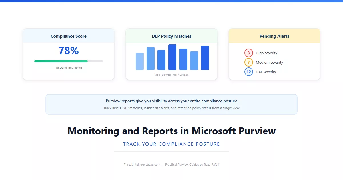
Compliance Manager lives under Compliance Manager in the Purview portal and gives you a single number – your compliance score – representing how well your Microsoft 365 environment aligns with data protection regulations. The score is calculated from improvement actions that Compliance Manager identifies based on your active regulations: GDPR, HIPAA, ISO 27001, and any others you have added.
Each improvement action is a specific configuration you should implement – enable audit logging, create a DLP policy for financial data, configure retention for Exchange. Completing an action adds points. The actions are prioritized by point value, so you can work down the list methodically.
The score updates within 24 hours of completing an action. Compliance Manager also tracks your score history, so you can show auditors a graph of improvement over time. A score trending up tells a story of active compliance management. A flat score tells a different story. Each action includes technical implementation details, links to the relevant Purview configuration page, and an assignment option to distribute work across your team.
DLP Reports and Activity Explorer: Spotting Patterns Before They Become Problems
The DLP reports are under Data loss prevention in the Reports tab. The main dashboard shows DLP policy matches over time – you want a steady, predictable line. A sudden spike usually means a new legitimate business process is triggering false positives or an actual data exfiltration attempt is underway. Investigate spikes immediately. A flat line at zero means your policies are either not in enforcement mode or are scoped incorrectly.
DLP incidents are grouped sets of related policy matches that Purview identifies as potentially part of a single event. Reviewing incidents is more efficient than reviewing individual matches. If the same user appears in multiple high-severity incidents, escalate to an investigation using the unified audit log to reconstruct their full activity timeline.
False positive and override rates tell you whether your policies are tuned correctly. A high false positive rate means your detection rules are too broad. Tighten your conditions or raise your instance thresholds. A high override rate means users are finding ways around the policy. Review the override justifications to understand the gap. Combine these reports with Activity Explorer filtering by DLP match to drill into specific events, users, or time periods.
Label Activity Reports and Insider Risk Dashboards
Under Information protection, the Label activity report shows how sensitivity labels are being applied, changed, and removed. This is where you measure label adoption. The report breaks down activity by label, by user, and by location. A healthy label program shows steady application volume and very few removals or downgrades.
If removals spike, someone may be deliberately stripping protection before exfiltrating documents. Filter by the user and cross-reference with Content Explorer to see what else they were doing. The report also shows label downgrades – when a user changes Confidential to Internal. Every downgrade that requires justification creates an audit record. I review downgrades monthly. Sometimes it is legitimate auto-labeling. Sometimes it is a red flag.
For insider risk, go to Insider risk management and open the Overview tab. The most useful metric is alerts per policy. If one policy generates 90 percent of your alerts, it either needs tuning or is catching something real. If you see persistent issues, review the common configuration mistakes guide – misconfigured insider risk policies are one of the top ten issues I see. Use the Users tab to see who accumulates alerts across multiple weeks. Patterns matter more than individual events.
Building a Weekly Review Routine That Catches Problems Early
I spend 30 minutes every Monday morning reviewing these dashboards in a specific order. It catches most problems before anyone else notices them.
Start with Compliance Manager. If your score dropped, find the improvement actions that regressed. Next, open the DLP reports and look at the match trend. Flat line? Your policies may be in simulation mode – review the DLP setup guide if you are unsure how to switch to enforcement. Sudden spike? Investigate immediately through Activity Explorer filtered to DLP matches for the past 7 days.
Move to the label activity report. Check application trends. If adoption is flat while your data estate grows, your labelling program is losing ground – revisit your sensitivity label publishing or consider auto-labeling with trainable classifiers. Finally, check the insider risk overview and review all high-severity alerts from the past week. Document your review – a SharePoint list entry with the date creates an audit trail you can show to regulators.
Leave a Reply
You must be logged in to post a comment.